Topperevod translation agency
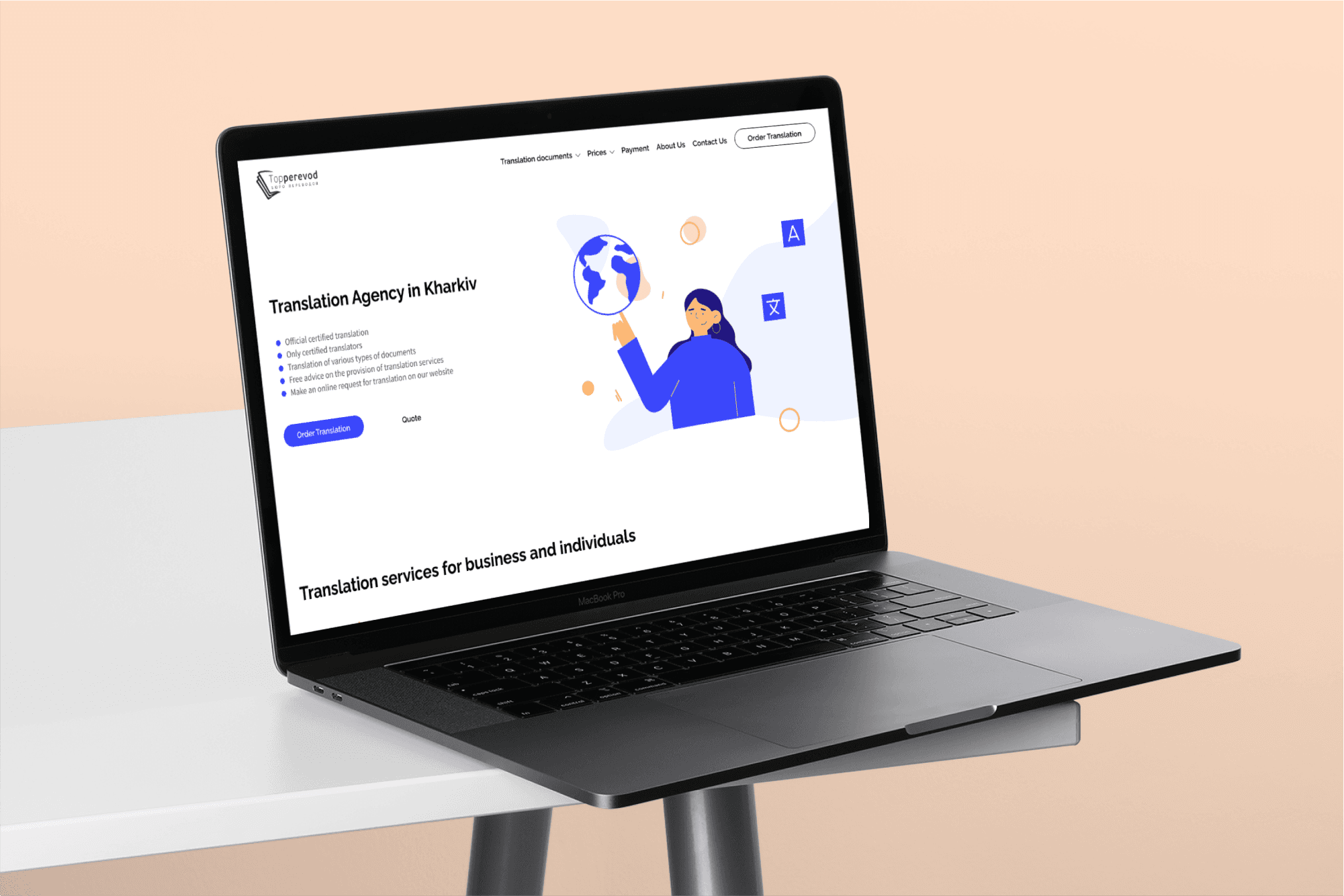
Landing Page Redesign for a Translation Agency
Client
Translation agency based in Ukraine, Kharkiv, offering translation in 70 languages and of everything from legal or financial documents to annual reports, marketing material, web content and contracts.
Challenge
The agency has been growing, It needed to update the main page with new content and refresh the look of it for more modern, so my task was to redesign the main page considering the principle and concept of the existing website, as it was essential to create the design that would attract new clients and establish the agency's credibility.
Achievements
I redesigned desktop, tablet and mobile versions of the main page. I gave it a fresh new look with new illustrations and visual design, and I also updated UI elements.
Role
UX/UI Designer, Illustrator
Year
2021
Tools
Figma, Zeplin, Adobe Illustrator
Team
Me
Methods
Brief, Design Audit, Market Research, Wireframing, Visual Design, Illustration
False
Overview
My approach included:
Writing a Design Brief: I began by crafting a comprehensive design brief to outline the project's objectives, target audience, design requirements, and timeline
Conducting a Design Audit: Given that the visual identity was outdated, I performed a thorough design audit.
Market Research: To make sure our design was spot-on and appealed to our audience, I did market research. This meant checking out the latest industry trends and looking at what our competitors were doing. All these insights helped me make design decisions and create a unique, relevant visual identity.
Creating Prototypes:
Low-Fidelity Prototypes: I started with low-fidelity wireframes to establish the basic structure and layout of the pages. These rough sketches allowed for quick iterations and feedback, focusing on functionality and user flow without the distraction of detailed design elements.
High-Fidelity Prototypes: After finalizing the low-fidelity prototypes, I moved on to high-fidelity versions. These detailed prototypes included refined design elements, accurate spacing, and realistic content.
Crafting UI Elements: I meticulously designed UI elements to ensure they were cohesive with the updated visual identity. This included buttons, icons, typography, color schemes, and other interactive components. The goal was to create a consistent and intuitive user experience across all pages.
Drawing Illustrations: To enhance the visual appeal and convey complex ideas more effectively, I created custom illustrations.
Design audit findouts and solutions
The visual hierarchy was unclear and could confuse a user. That's why I proposed a new one with larger typography for headings, bolding important text, using colour to differentiate different type of content and adding white space. All of that help guide the user and keep their attention.
I enhanced the primary colour by making it slightly more vibrant, maintaining a calm and focused feel while reinforcing the agency's image as trusted and reliable.


Updating the illustrations was a strategic move to improve the website’s aesthetics and usability. The previous illustrations were outdated and didn't reflect our current brand image. Updating them helped modernize the website and make it more visually appealing to users. Also, the updated illustrations are clearer and more relevant to the content they accompany. This helps users better understand the information presented and improves the overall usability of the site. Fresh, vibrant illustrations can capture users' attention and make their browsing experience more enjoyable. This leads to longer visit times and increased interaction with the website.


