Kyiv Lights Festival
Kyiv Lights Festival

Client
Kyiv Lights Festival is unforgettable atmosphere created by an international festival of light and media arts in the Ukrainian capital. The stunning possibilities of advanced technologies turn the city into an open-air art gallery with colourful light sculptures, installations, and projections.
Challenge
Kyiv Lights Festival is a cutting edge event and one of the festival’s brightest events is the international 3D video mapping contest. Media artists from different countries are invited to transform the building of Kyiv City. However, the festival's visual style was outdated and didn't reflect that.
Achievements
I provided a recognisable visual style concept and developed a broad graphic system which contains animations, posters, banners, merch and so on.
Role
Graphic designer
Year
2020
Tools
Cinema4D, Adobe Illustrator, Adobe Photoshop
Team
Me
Methods
Research, Identity, Communication, Motion Design
False
Research
For starters, I analysed the festival as a brand and defined its current positioning. Then I wanted to understand the audience. The festival has two key audiences — the media artists that take part in the festival and the visitors. To understand the audience I conducted surveys and interview with them. Based on collected information I created potential audience portraits that highlight their key points, interests and needs. My next step was to analyse direct and indirect competitors and the market.
Insights that I got during the research phase helped me to create a visual identity. One of them is that the festival provides a unique visual experience and that's what makes him different from the other city events. Also, the clients defined the main goal for the festival — to be the platform for the media artists. Therefore, a metaphor for the visual identity I choose is that buildings are the artboards for artists.
Logotype
At a briefing session, the client said that their logo was a rush job. I think it's the main problem of the logo. As a result, it's not scalable at all and negligent. Also, the logo has nothing to do with the festival.
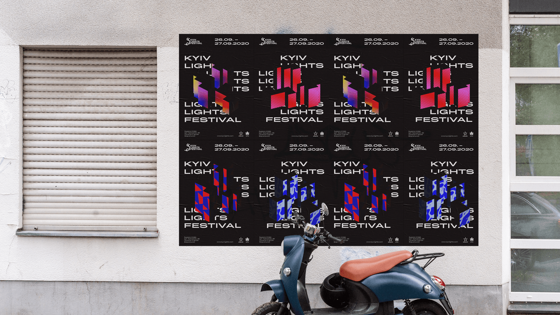
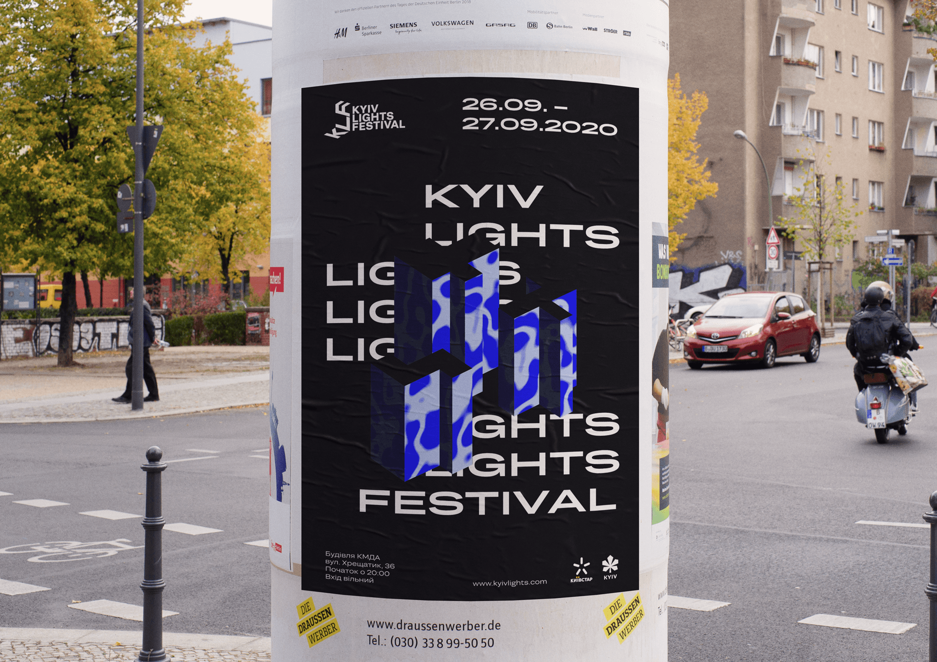
The new logo bears the display of lights projection on the objects and has monumental typography which speaks about buildings.

Visual communication
The idea for the visual identity is based on the metaphor that displays the essence of Kyiv Lights Festival. Thanks to media artists, light transforms streets, buildings and widens the limits of people's perceptions. It is the major difference between the festival with other entertainment events in the city.
To express the idea I developed a broad graphic system which is characterized by using bright colours, contrasts, bold monumental typography, animation that speak about unique visual experiences which people can get in the city during the event. The visual form makes the festival braver and brighter and also the identity is easy to implement.